
by Clive M. Law
In late 1931 National Defence Headquarters (NDHQ) decided that a total revision of Dress Regulations (DR) was required. A minor update had been published in 1924, primarily to address changes in Service Dress and the sequence of wear for the many Orders and decorations bestowed on Canadians during the First World War. The previous exhaustive compilation of dress instructions had been promulgated 25 years earlier, in 1907. It was woefully out of date.
The process to revise the 1932 DR started with identification of the basic, common-to-all, dress instructions for every item of wear from boots to gloves, tunics, badges, to head dress, etc. Then each regiment and Corps was polled to confirm or amend the compiled information. Needless to say, this involved an incredible volume of correspondence, compounded by the use of District headquarters as intermediaries. The Districts’ role was to merely transcribe the questions and forward these to the units under their control and when the replies were received, transcribe these and forward the same to Militia Headquarters in Ottawa.
The Argyll Light Infantry was directed in June of 1932 to confirm that they wore the traditional undress forage cap of a Light Infantry regiment, i.e., green cloth with green welts. Several weeks later the reply received stated unequivocally that “The Officers of the Argyll Light Infantry have not, in the past, worn the green cloth Undress Forage Cap authorized for Light Infantry Regiments: nor do they desire to adopt this pattern of headdress”. Based on this reply Militia HQ assumed that the ALI wore the standard blue cloth cap with band of maple leaf lace and a red welt on the crown.
No more would have been said about the regiment’s headdress had it not been for a letter from the Montreal outfitter, William Scully Ltd. In September 1933, Scully’s wrote to NDHQ requesting clarification about the ALI’s headdress. In the letter Scully stated that they had been supplying Service Dress (khaki) caps to the ALI complete with a ‘diced braid band’ and wished to confirm that this same diced band could be provided on the Undress Forage Cap. Within days NDHQ replied to Scully’s, “I beg to state that no authority has ever existed in Dress Regulations for the Canadian Militia for the officers of this regiment to wear red, white and black diced bands on their forage caps and service dress caps.”
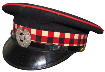
An example of the Argyll Light Infantry cap with diced band and red welt on the crown. This cap, which dates from approximately 1920, was not authorized. Although the ALI had declined to wear the green Light Infantry cap they were authorized to wear this blue cap with a maple leaf band.
At this point NDHQ undertook some research and discovered that the Argylls had worn a diced band as early as the 1870s when ‘Argyll’ was added to the regimental name, although no formal authority had ever been published in General Orders, It was obvious that Militia Headquarters had dropped the ball in 1932 by not following up. After the Light Infantry cap had been dismissed out of hand, NDHQ should have determined exactly what cap they wore.
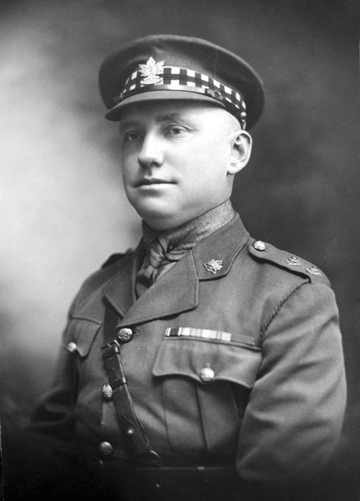
Lieutenant L.F.Green wearing the diced band on his Service Dress cap. Permission for variance this was not forthcoming and the ALI was advised to cease this practice. The photo is that much more interesting as Lt Green wears the cap badge of the 2nd Battalion, CEF, which was raised in large part by the ALI, now perpetuated by the Hastings and Prince Edward Regiment. Photo courtesy the Hastings and Prince Edward Regiment museum.
The sole face-saving solution to this conundrum was to obtain retroactive permission and ‘bless’ the diced band for the Undress Forage Cap. Finally, in January 1934, the Secretary of the Department of National Defence approved a blue cap, with red, white and dark blue diced band, and a ‘scarlet welt on the crown only’. Of note, the diced band now included dark blue instead of the original black.
Insofar as having diced bands on the khaki Service Dress cap, NDHQ was firm in its stance that no variation would be permitted and the diced band could no longer be worn.
When the Argyll Light Infantry was converted to a ‘Tank’ battalion in 1937 they were advised, in April of that year, that tank battalions were now authorized to wear the ‘Black beret of the pattern worn by the Royal Tank Corps’. Ironically, the adoption of the beret for all orders of Dress meant that the long-fought battle for a diced band on the forage cap became moot, as that type of headdress would no longer be worn by the Argylls.
Permission to wear the black beret had been extended to several regiments and the new armoured fighting vehicle training school. Affected regiments were also advised that the black beret would be worn in both Full Dress and Undress, ‘with a distinctive flash’ and the regiments were to submit a pattern of flash for NDHQ approval. In the terminology of the day, a ‘flash’ would consist of an embellishment such as a plume, similar to that worn by the Royal Tank Corps.

This drawing was meant to clarify the ALI request for a patch and flash. However, it resulted in more confusion and additional questions. (Source LAC)
Not willing to admit defeat the ALI identified their ‘flash’ as a ‘diced band… in the form of a plaque, running horizontally under the badge.” This caused confusion at NDHQ and they were quick to ask for clarification by requesting ‘….that further details of the proposed plaque may be submitted, viz, the dimensions, the metal of which it is to be made, the method of attachment to the beret and the manner in which the colours of the diced band will be shown thereon.’ NDHQ went on to suggest that the ALI submit their reasons for recommending a plaque, instead of a patch.
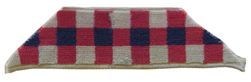
The sample patch for use on the black beret, sent to National Defence Headquarters. This example is attached to the original correspondence held by the Library & Archives Canada (LAC).
The Officer Commanding the ALI replied stating that ‘it was not his intention to have the diced band placed on a metal plaque, but worn in the form of a patch.’ Demonstrating they had not given much thought to their proposed dicing, the ALI requested a sample beret from NDHQ in order to try out ‘different patches’ to determine the proper size.
In October, Major-General Caldwell, the Master-General of the Ordnance, intervened and noted that ‘a beret with a regimental coloured band has recently been authorized for the (British) 11th Hussars … and a sample of this beret is being obtained.’ Five months later, in April 1938, a brown beret of the 11th Hussars as well as a black beret as worn by officers of the Royal Tank Corps were forwarded to the ALI for their consideration.
At the end of May the Argylls forwarded a drawing of the patch they wished to adopt. The drawing included their proposed patch, and additionally, a flash in the style of that worn by the Royal Tank Corps. Rather than provide clarity, further confusion was created at Headquarters. They formed the impression that the ALI now wished a patch in lieu of a flash and sought clarification. They asked if the ALI ‘wishes to have a flash as well as a patch’ and, if a patch was desired to advise the colours ‘which should not be the same as worn by the Royal Tank Corps’ (brown, red and green1). The drawing also raised questions about the dicing which was eight squares wide while NDHQ preferred that the ALI use dicing limited to three squares wide, in keeping with the pattern approved for the Undress Forage cap. While waiting for confirmation from the ALI, (their Commanding Officer was absent due to illness), information was received in Ottawa that the (British) Army Council had approved the use of the RTC colours by Canadian Tank battalions. This new information was conveyed to the ALI in October 1938.
Finally, in November the ALI agreed to use the ‘traditional’ flash and provided the preferred dimensions. No doubt, NDHQ was tired of dealing with this issue and accepted the proposed flash dimensions of six inches along the base, three inches along the top, cut diagonally through the squares at 45 degrees. It was further agreed that the ALI would continue to wear the existing badge, without the addition of the designation ‘Tank’, until such time that a new die could be made and the badges were procured by HQ. The Argylls were the first regiment to wear the black beret in the Canadian army. And, they were proud to wear the regimental dicing on the same berets.2

A fine example of the finished product. With the advent of the Second World War there was little opportunity to wear the beret with both the patch and the flash. Beret courtesy the Hastings and Prince Edward Regiment museum.
Notes
1. First used at the battle of Cambrai when a flag with these colours was unfurled, representing ‘Through the mud, and the blood, to the green fields beyond.
2. It would be December 1940 before the existing cap badge die was sent to the Lackie Manufacturing Company to be altered, at a cost of $12.00, to include the ‘Tank’ and 1941 before new badges were made.
Postscript
When the Dress Regulations were finally published in 1932 the entire section dealing with the Infantry was omitted. This was mostly due to the difficulties in obtaining accurate details from a number of regiments. Curiously, the Cavalry, including Hussars, are well described. After many years of research the author has located the unpublished drafts of the Infantry Corps. Publication of this section was delayed by the Second World War and was mostly out of date by the end of the war.
The author wishes to thank Bill Alexander for his editorial review.
by Roger V. Lucy
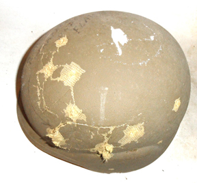
From the late 1970s a number of Western countries began to develop new combat helmets made of composite materials or ballistic plastics. The most commonly used are Aramid nylon (i.e. Kevlar or Teuron); polyethylene (Spectra, Dyneema or Corlon); and Glass-Reinforced Plastic (plastic impregnated with glass fibres). The use of composites allows more scope for designing a ballistically desirable shape than pressed steel. The best known of these early composite helmets was, of course, the US Personal Armour System, Ground Troops (PASGT) colloquially known as the “Fritz” from its resemblance to the old German Stahlhelm, but both Britain and Israel introduced ballistic helmets at this time, the GS Mk.6 and Orlite OR201 respectively.
In 1981, DND initiated project L1939, the Soldier’s Helmet Replacement Project, the start of what to become a 16 year-long process to replace the M-1. Clearly not much happened for the first three years as the project timetable, as outlined in a December 1984 report was:
- Phase I (Jan 84 – Oct 84) Examination of foreign helmets for deficiencies in the area of comfort, acceptability and equipment compatibility.
- Phase II (Nov 84 -Mar 85 ) Development in conjunction with industry of an advanced development model based on design criteria, established during Phase I.
- Phase III (Apr 85 – Sep 85 ) Production of engineering developmental models in two size ranges and three models for further evaluation
- Phase IV (Nov 85 -Mar 86 ) user and ballistic trials and establishment of final modifications.
- Phase V (Apr 86 to Sep 86) Development of final engineering development models
In 1984 examples of the new British, Israeli (a Kevlar export version, the OR402 was used) and US helmets were obtained and subjected to field trials. These were held at Heals Range in Saanich Country on Vancouver Island between October 1 and 12, 1984, using 20 soldiers from 3rd Battalion PPCLI. The aim of the trails was to obtain precise information, under controlled conditions, so the design authority could contract with Canadian Industry for the development of a prototype Canadian helmet. Note that from the get-go the intention was to develop a helmet in Canada, not to procure one off-shore.

PASGT 1984 trials
Mk6 1984 trials

OR402 with PASGT chin-strap 1984 trials
Each soldier received a helmet for a day and half for evaluation, before being given another to try out. Tests included operating various individual and crew-served weapons, determining how well the helmets fitted with communications equipment, NBC gear, hearing protectors, cold weather caps, and fragmentation vests. They also evaluated the helmets’ stability during Section field craft and over an obstacle course. Some of the US and Israeli helmets were modified by swapping their respective chin-straps. The PASGT normally has a two point chin-strap, the Orlite had a three-point harness copied from the old British airborne helmet, and the Mk6 had a more modern three-point harness.

PASGT with Orlite harness 1984 trials

PASGT 1984 trials with Mk6 harness
Overall, the Israeli helmet came out best, except its old airborne harness was found to be incompatible with the Canadian NBCW mask. The PASGT’s main problem was stability, when used with a two-point chin-strap, but when retrofitted with the Israeli harness it proved practically impossible to sight most weapons. The PASGT’s peak was also found to obstruct vision, while its Germanic appearance caused some negative resonances.
The British helmet came off well in terms of stability, weapons sighting, easy adjustment, and its three point quick-release chin-strap. However the brow pad and head band tended to cause sweating and it was not compatible with the Canadian respirator. Subjectively users felt its dark green shell was not as ballistically strong as light green US and Israeli helmets. This view may have been influenced by the ballistic trial where the British helmet was “completely destroyed”. The Israeli helmet fared little better, while the PASGT proved the most resistant.

OR402 1984 trials ballistic test
PASGT 1984 trials ballistic test

MK6 1984 trials ballistic test
Overall, it was concluded that a hybrid of the Israeli helmet, using a revision of the US internal suspension and a British-type three-point chin-strap with no chin-cup but a direct-snap quick release buckle would best meet the Canadian Forces requirements. Interestingly enough, around that time Orlite did bring out a revised version of its helmet with such a harness (except it did have a chin-cup). It was adopted by a number of countries, including Ireland and South Africa, but this seems to have escaped DND’s notice.
Israeli export helmet with modernized harness
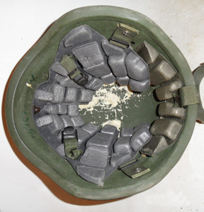
Instead, Canadian soldiers had to wait another 12 years for a modern helmet, because as originally planned, working out a design was put out to tender, with the winning bid going to the Barrday Co. of Cambridge, Ontario. At the time Barrday was a subsidiary of Allied Signal, which had developed Spectra©. In 1987 Barrday developed a prototype spectra helmet which closely resembled the PASGT, but with flatter sides and a higher back. It had a rather complex three-point web chin-strap and nape support, and a Styrofoam trauma liner, based on that of the Cooper hockey helmet (only in Canada). Depending on size, the Barrday P-1 Soldiers’ Helmet weighed between 1.2 – 1.6 kg. helmet. Between 1988 and 1990, Barrday produced a substantial number of helmets (reportedly 3,625) for ballistic, engineering and user trials.

Barrday P1 1988 left

Barrday P1 1988 interior

Barrday P1 x88 2433 label
Efforts to get information about this program through Access to Information requests have largely drawn a blank, but some information can be gleaned from the driblets that were released. Barrday helmet seems to have performed well ballistically.

Barrday P1 ballistic test exterior
Barrday P1 ballistic test interior
However, field trials, which took place in 1989 and 1990, identified significant short-comings with the foam hockey liner, in particular severe discomfort from excessive heat build-up (presumably less of an issue on the ice-rink than on the battle-field). A number of Barrday helmets (now designated P-2 Soldiers’ Helmets) were retrofitted with M-1 cradle suspensions and new trails were held in 1991. While the heat problem was resolved, and the helmet was almost fielded (some were issued on a limited basis to some of the Canadian peacekeeping contingents, including the Royal Canadian Dragoons in Somalia and the RCMP in Former Yugoslavia), the Barrday helmet proved incompatible with existing and future equipment, such as: the C4 respirator, the Slimgard head-set, the C7A1 optical sight; night vision equipment and the new Canadian armoured vest. There were also quality control problems – reportedly “delamination” of the helmet bodies under field conditions. The contract was cancelled in 1992, after Barrday was sold off by Allied Signal. Barrday, however, still offers helmets of this design (but made from Kevlar) for police and commercial export markets.
Barrday P2 1991 interior
In the meantime, to meet the needs of Canadian peacekeepers, successive off-the-shelf purchases of PASGT helmets were made from the USA. Not surprisingly satisfaction with the PASGT was less than total, as the problems encountered in during the 1984 trials had not gone away. Moreover, painting the helmet (i.e. UN blue) can damage the resin matrix and can lead to delamination. The acquisition of a new helmet was now placed on a “fast track” and rather than re-inventing the wheel (again) it was decided that the new helmet would be acquired “off-the-shelf” with some modifications. These were based to a set of human engineering criteria (protection, fit, comfort and compatibility) that DCIEM was tasked with developing in October, 1992. The renewed helmet project began with testing six off the shelf designs (including the German Gefechtshelm (Schuberth 826), the French TC-3, the PASGT and the Barrday P-2) with 2 Canadian Mechanized Brigade Group personnel at Petawawa.
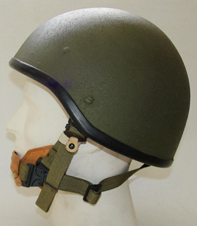
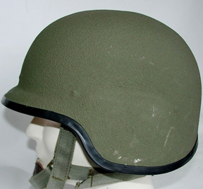
The process was completed in May 1996 and a contract to produce 60,000 helmets was issued to the French company Gallet, which produced the TC-3 helmet, and variants on that theme, for the French, Danish and Austrian armies. The TC-3 marries the PASGT shell with a French lining and harness. It was adapted for Canadian use by reducing the front peak to accommodate the C-79 optical sight, widening the flare at the sides so that it can be used with Canadian headsets, and redesigning the retention system to make it compatible with the C-4 gas-mask. Designated the CG634, the new Canadian helmet is made of Aramid (Kevlar) and has a minimum v50 of 634 m/s (compared to the PASGT’s 610 m/s). To meet “defence industrial benefits” requirements Gallet established a plant at St. Romuald, Quebec. The first production run of 60,000 helmets began the spring of 1997 and there have been subsequent runs to meet on-going requirements. However Gallet was taken over by the USA company MSA in 2002 which closed the St. Romuald plant in 2004. Subsequent buys have had to be placed with MSA in the United States.
French Gallet TC 3

CG634
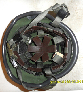
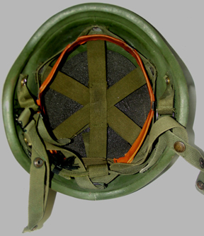
CG634 interior
The CG634 has now served for over a fifteen years, and has seen extensive combat in Afghanistan. Experience in the field have revealed problems arising from all the add-ons being now being loaded on the helmet (such as NVGs, visors, and nape-protection) which increase the weight beyond what was considered in 1996. To address these, a liner and fit system up-grade was developed in 2008 to improve fit, comfort- including passive cooling; and impact protection. Tests were also carried out in 2008 using twelve CG634 helmets fitted with the pad system found on the new US ACH helmet (a design based on the MSA-Gallet TC-2000). Overall, however, DND believe that the CG634’s combination of a trauma liner and cradle suspension with a four-point retention system give it an impact attenuation which meets or exceed the US ACH standard.[i]
[i]. Documents released under Access to Information Request A-2008-01286; Personal communications NDHQ DSSPM and Ed Storey, Barrday and Gallet sales literature, Esprit du Corps October, 1998.
© 2011 Bill Alexander and Clive Law
The call up of regiments for the Canadian army during the Second World War was not a random hodge podge exercise. Mobilization was based upon the structure and needs of the proposed Canadian field army. Innovations and the changing methods of war led to new tactics and demands for different types of units. The British army formed the Reconnaissance Corps in 1941, tasked with using light armoured vehicles to provide intelligence and screening for large formation operations. Canada, operating with orders-of-battle and war establishments similar to British, followed suit, and mobilized or converted regiments to perform the same roles in Canadian formations.
In western Canada, the need for reconnaissance units resulted in the call up of a composite regiment, drawing upon the units of the 4th Cavalry Brigade from Manitoba. The 18th (Manitoba) Reconnaissance Battalion, Canadian Armoured Corps was authorized by General Order 160, effective May 10, 1941. Men from the 12th Manitoba Dragoons, the Manitoba Mounted Rifles and the 2nd Armoured Car Regiment were recruited to form this new battalion. As a recce battalion, they began the complicated technical training required for modern mechanized units.[i]
Initially, the 18th (Manitoba) Reconnaissance Battalion was detailed as the reconnaissance regiment for 4 Canadian Armoured Division. While the role and nomenclature of the unit was evolving, the identity and cohesiveness of the new regiment needed to be addressed. As a composite unit, the officers and other ranks wore a combination of badges reflecting their original militia units. Cap badges for the three units were commonly seen during training, a factor working against a new regimental homogeneity. In December of 1941, designs for cap and collar badges for the 18th Recce had been submitted to NDHQ and forwarded to Col. E.L.M. Burns, Officer Administering the Canadian Armoured Corps overseas.[ii] Policy decisions for the badging and insignia of the Canadian Armoured Corps were being made at the same time, and it was advised that the insignia provisions for the 18th be deferred until those matters were settled. On January 26, 1942, the unit was re-designated the 18th (Manitoba) Armoured Car Regiment. [iii] Meanwhile, the design sat in files, awaiting action.
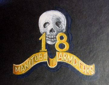
The badge design submitted was very similar to the 2nd Armoured Car Regiment, the original unit of the 18th’s commanding officer, Lt. Col Coupland. It was described as a winged automobile wheel surmounted by the numeral “18”, a scroll above inscribed “MANITOBA ARM’D CARS, with a skull superimposed on the wheel, and the entire design having a scroll below with the Latin phrase Palman Serentes Redite, (Return Bearing the Palm of Victory). The entire badge was ensigned by the Imperial Crown. Collars were proposed with a skull over the unit number “18”, again surmounting a scroll reading MANITOBA ARM’D CARS. Brass buttons were proposed with the skull centered on the button, “18” surmounting the skull, and ARM’D CARS below. The badges were to be brass with white metal for other ranks, and brass or gilding metal with a white metal or silver skull for the officers. Consideration was given to making the entire badge in white metal, for visibility on the black armoured corps berets The designs were approved by General Order 313 1942, August 6, 1942. [iv]
The approved cap badge of the 18th Manitoba Armoured Car Regiment. It was to measure 1 7/8 inches high by 2 ¼ inches wide. LAC RG 24 Vol 2266 File HQ 54-28-1043-2.
With the design approved, cost quotations were requested, and estimates were submitted by Scully, Gaunt and Cote Engravers in early July. Procuring insignia required approval of the Inspection Board of the United Kingdom and Canada (IB), and with their approval, steps were taken to acquire the badges. On July 14, NDHQ replied that the funds to produce dies and 1,000 sets of badges by one of these makers were available.
On August 12, the 18th (Manitoba) Armoured Car Regiment was ordered to proceed overseas. The unit embarked on August 19 without an issue of new cap badges. Overseas, the matter came to the attention of the GOC 4 Canadian Armoured Division, and a message requesting that 1500 cap badges be despatched by bomber mail, as soon as available, was wired to Canada. The badges were not available, and it appears the procurement had been forgotten with the unit’s move to the United Kingdom.
The approved collar badge for the 18th Manitoba Armoured Car Regiment. LAC RG 24 Vol 2266 File HQ 54-28-1043-2.

Button drawing for the 18th Armoured Car Regiment. It is not consistent with the description submitted for the design. DHH.
Button drawing for the 18th Armoured Car Regiment. It is not consistent with the description submitted for the design. DHH.
In the meantime, fate intervened. The new commanding officer, Lt. Col. J.S. McMahon, appointed shortly before the 18th Recce left Canada, considered the “present design unsuitable”. The design also found disapproval at much higher levels. In late September 1942, Major General J.P. Montague, the Senior Officer, CMHQ wrote the Deputy Quarter Master General (Canadian Army Overseas) that:
- I saw a cable going through regarding badges for 18 Armd Car Regt, 4 Cdn Div. Apparently they had never been supplied …and have now been advised that the work on the badges has not yet started. I saw the design of the badge and it is a very poor one. The reconstituted unit wishes to get out a good design and have it made in this country of plastic. The design is a plain buffalo and is an excellent one which will associate the unit with Manitoba.
- I wish you personally, when you are in Canada, would deal with this and while you are away that the A.D. Q.M.G. would follow this up and facilitate in every way the obtaining of the new plastic badge, referring to me at any time if there is any delay.
- At present there are at least a dozen different badges used by the officers and this is very undesirable.
Montague’s sponsored design was a North American bison, standing on the prairie, over a simple banner reading MANITOBA. It bore a striking resemblance to the 12th Manitoba Dragoons badge, the badge worn earlier in the career of the Senior Officer, CMHQ. The CO of the 18th Armoured Car Regiment embraced Montague’s badge, but complications arose.
The GOC First Canadian Army weighed in on the discussion indicating “I see no objection to the Buffalo of the 12 Man Dns provided there is a “difference”, this could be accomplished by a completely different patterned riband (scroll).” Next the debate spanned the Atlantic Ocean, and Col. Fortesque Duguid, Director of Historical Services at NDHQ, replied that “the rights of a unit to its authorized badges and buttons should be respected.”[v] This debate over the badge for the 18th Manitoba Armoured Car Regiment further slowed acquisition of the regiment’s insignia.

The cap badge design as proposed by Maj. Gen. J.P.Montague. Note: the scale of this drawing is not to exact size. LAC RG 24 Vol 2266 File HQ 54-28-1043-2.
Despite the advocacy of the Senior Officer CHMQ, the new request did not sit well with the Master General of Ordnance in Canada. Major General J.V. Young replied by telegram to Montague on 28 October 1942:
Designs of badge for 18 Armoured Car Regiment conveyed by DQMG resembles too closely badges of 12 Manitoba Dragoons still being worn by Reserve unit therefore cannot be authorized as a new badge for 12 A C R. …Suggested as an alternative that unit adopt 12 Manitoba Dragoons badges entirely and apply for change in subsidiary title otherwise new design will be required…Reply cable action proposed and state approximate average costs of moulds for plastic badges.
Further weight was added to the MGO’s suggestion when CMHQ added that the 12th Manitoba Dragoons were the senior unit, forced into the 18th Manitoba Armoured Car. Effective December 16, 1942, the unit was re-designated the 18th Armoured Car Regiment (12th Manitoba Dragoons), C.A.C.[vi]
Maj. Gen. Montague may have lost the badge design battle, but he had won an active service designation for his former unit, where he had served as a junior officer. Shortly after the re-designation the unit acquired the 12th Manitoba Dragoons cap badge. On January 12, 1943, the 12th Manitoba Dragoons were designated the reconnaissance regiment for 2 Canadian Corps, and transferred to that formation. The 12th Manitoba Dragoons would serve as the 2 Canadian Corps armoured car regiment during the campaign in northwest Europe, wearing the cap badge of that proud prairie regiment.

22th Manitoba Dragoons brass other ranks cap badge as adopted by the 18th Manitoba Armoured Car Regiment. Image courtesy of Dwayne Hordij.
22th Manitoba Dragoons brass other ranks cap badge as adopted by the 18th Manitoba Armoured Car Regiment. Image courtesy of Dwayne Hordij.
[i] Tascona B, XII Manitoba Dragoons: A Tribute, Manitoba Dragoons History Book Committee, 1991. P71-72, and Tonner M. On Active Service, CD ROM, Service Publications, Ottawa.
[ii] The protocol for insignia approval at this time required that units serving overseas have their badges approved through CMHQ. It was desired that the badges be consistent with the system for the Canadian Army (Overeas). As the 18th Recce was to serve overseas, they referred the approval to overseas authority.
[iii] Historical Section, Canadian Military Headquarters, Report No 168, The Organization of First Canadian Army, 1946, and Tascona, ibid.
Various correspondence, dated December 1941 and July 1942. Record Group 24, Volume 2266, File HQ 54-28-1043-2.
[iv] G.O. 313 1942. Part “A” General Orders 1942. LAC RG 24 Vol 2266 File HQ 54-28-1043-2.
[v] Messages and correspondence from File 13/18 ACR/1. September 1942. LAC RG 24 Vol 2266 File HQ 45-28-1043-2., and Tascona, ibid, p83-85.
[vi] Messages and correspondence from File 13/18 ACR/1. September 1942. LAC RG 24 Vol 2266 File HQ 45-28-1043-2.
by Roger V. Lucy
During the Second World War, the Canadian Department of Pensions, Health and Welfare (DP&H) was responsible for the Air Raid Precautions Service (called the Civilian Protection Corps – Corps de Protection Civile in Quebec), and in addition to acquiring helmets from DND stocks, and factory rejects, ordered 155,000 mild steel helmets in 1942 from General Steelwares to equip various emergency agencies. These helmets were made of magnetic steel and their chin- strap lugs were spot-welded, rather than riveted, to the brim (one was used the model for the helmet that rests on the Tomb of Canada’s Unknown Soldier). They are also marked G.S.W. D.P.& H. and lack the date or batch number found on military helmets. ARP helmets are normally in their issue khaki, and may have a letter to designate the wearers function i.e. F for Fire Service, P for Police, U for Utilities and W for Warden. Senior Wardens wore white helmets with a symbol to designate their level. The letters ARP or CPC may also be found on the front of the helmet.[i]
Helmets were again distributed to the Civil Defence organizations after the War. In May 1951 the Department of National Health and Welfare, which was in charge of Civil Defence coordination gave permission for the distribution of helmets. The anticipated requirement was for 150,000 helmets. In April 1952 Treasury Board authorized $40,350 to buy 27,400 surplus helmets from Visco Petroleum Products of Toronto and 6,000 from Salvage Disposal Corp of Montreal. There also exists correspondence from this period from dealers offering US Office Civil Defense helmets, many examples of these hemets with Canadian Civil Defence markings exist, although there is no record of their purchase. Examples also exist of Mk.II helmets fitted with US made liners -correspondence about receiving mildewed liners would seem to describe liners of this sort.
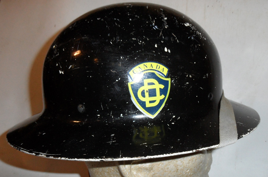
Fig 1 – Black helmet for Engineering section
Civil Defence helmets were issued to a variety of emergency agencies, usually at the provincial or city level , and were colour-coded to indicate the wearers’ functions. Civil Defence Operational Operational and Training Circular 7/51 of 29/05/51 laid down the following colours for CD helmets:
- Auxiliary Fire Service – Red
- Auxiliary Police Service – Blue
- Wardens – White
- Rescue and Engineering – Black
- Ambulance and Medical – Green
- HQ and Welfare – Khaki
Civil Defence Operational and Training Circular 19/53 of 12/08/53 further directed that the CD badge (a yellow disc with a blue maple leaf in the centre and blue border with CIVIL DEFENCE) be applied to the front above the brim. Helmet colours were also changed slightly:
- Health Service was now maroon (Cilux “Rex Maroon” – a rather flat brown shade thereof),
- Welfare Service was green (Cilux “Bristol Green” a sort of emerald shade)
- Damage Control was yellow (Cilux “Patrol Yellow”)
By October 1952 16,500 decals had been obtained and were distributed as follows:
- BC 1,000
- Alberta 1,000
- Saskatchewan 500
- Manitoba 1,000 English, 100 French
- Ontario 4,000
- Quebec 2,000 English, 3,500 French
- New Brunswick 500 English, 200 French
- Nova Scotia 1,000
- Newfoundland 500
- Reserve 4,400 English 1,700 French
- Training 600
The 1953 colour scheme was reissued in January 1958. “Damage Control” was now termed “Sector Control”. A new pattern CD decal was also issued (although the old pattern could still be worn).
This used an internationally recognized symbol, with the linked letters CD in yellow on a yellow -rimmed blue shield.[ii]
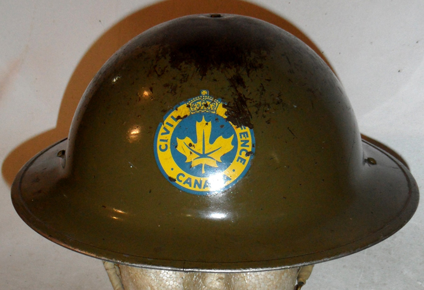
Fig 2 – MKII helmet manufactured by CLC 1943, and worn by HQ and Welfare
The 1953 colour scheme was reissued in January 1958, however “Damage Control was now termed “Sector Control. Both old and new pattern CD decals could be used – the new pattern presumably the linked letters CD in yellow on a yellow rimmed blue shield.
A document of 9/4/52 issued by the Vancouver CD Coordinator gives the following rank insignia – there is no documentary indication if this was used in other districts, but examples coming from other provinces indicate that at least elements of this system was used elsewhere.
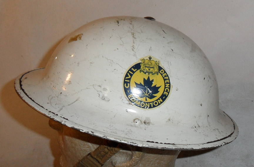
MKII helmet manufactured by CLC and dated 1943. Marked to the EDMONTON Civil Defence (Warden), early decal.
Warden Service (White helmets)
- Chief Warden – three black diamonds below the CD decal
- Assistant Chief Warden – idem
- Sub-division District Chief Warden – two black diamonds below the CD decal
- Assistant Sub-division DCW – one black diamond below the CD decal
- District Warden – two black bars above or in line with the CD decal
- Assistant District Warden – one black bar above or in line with the CD decal
- Sector Warden – SW below the CD decal
- Post Warden – PW below the CD decal
- Warden – W below the CD decal
Coordinators (khaki helmets)
- Coordinator or Director – three white bars below the CD decal
- Assistant Coordinator or Director – two white bars below the CD decal
- Sub-division Coordinator or Director – one white bar below the CD decal
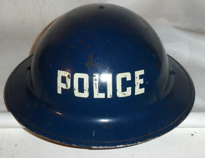
MKII Helmet manufactured by CLC, dated 1941 and clearly marked POLICE.
Auxiliary Police Service (blue helmets with POLICE in white at the front, over the CD decal)
- O/C Police – Crown (over the insignia)
- Assistant O/C Police – three white diamonds (over the insignia)
- Inspector – twowhite diamond (over the insignia)
- Sub Inspector – one white diamond (over the insignia)
- Sergeants – two white bars each side
- Corporals – one white bar each side
- Constables – no rank badge just the APS insignia
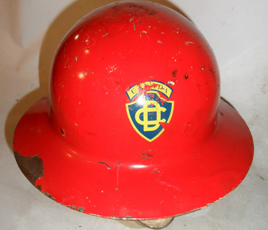
Fig 3 – Fire fighter, late decal.
Auxiliary Fire Service (red helmets with FIRE in white at the front, over the CD decal)
- Chief – 11/2″ white band around the side and top
- Deputy Chief – idem
- Assistant Chief – 11/2″ white band around the side
- District Chief – two 1/2″ white band around the side separated by ½”
- Captains – one ½”white band
- Lieutenants – 11/2″ black band around the side
- Firemen – – no rank badge just the AFS insignia
Medical Service (green helmets with CD insignia)
- Chief Medical Officer – MO in white over three white bars
- Deputy Chief Medical Officer – idem
- Divisional Medical Officer – MO in white over two white bars
- District Medical Officer – MO in white over one white bars
- Doctors – MO in white
- Nurses – N in white
- Ambulance Drivers – D in white
- Health Department – H in white
- Red Cross – Red Cross on white ground
Engineers Black helmet with CD insignia and white letters ands rank markings
Sections:
- Water – W
- Sewer – S
- Gas – G
- Electric – E
- Roads – R
- Bridges – B
Rank badges (below the section letter)
- Section Chief – three bars
- Assistant Section Chief – two bars
- Sub-Division Chief – one bar

Fig 4 – MKII helmet manufactured by CLC 1942, and worn by an Assistant Chief Electrical Engineer.

Fig 5. – The exterior has received yet another paint job Cilux “Rex Maroon” the new colour assigned to Medical/Ambulance organizations in 1953.

Fig 6 – This helmet is a recycled Mk.I from the Great War. The chin-strap lugs have been removed and replaced by web straps riveted to the brim, The web and oil-cloth liner is a type made by a US Company, Cairns, and is often found in commercial US civil defense helmets, The helmet has been painted green, which in the original 1951 colour scheme was used for Medical/Ambulance organizations.
by Bill Alexander and Raymond Gilbert © 2011
This article is intended as a primer for collecting Second World War (SWW) Canadian cloth shoulder insignia. This paper will focus on cloth shoulder title insignia, with comments on formation insignia as relevant. The cloth shoulder title evolved during the war years, becoming a ubiquitous feature of the battledress uniform. Formation patches (Brigades, Corps, and Divisions) also underwent major changes during SWW as the army would institute then discontinue complex distinguishing signs with imposed corps or regimental abbreviations on the formation patch. Eventually a plain formation patch without any imposed lettering became standard issue. This was worn in combination with the regimental or corps shoulder title.
The overall goal of insignia policy for the Canadian Army was to produce descriptive insignia that were useful to enhance moral and indicate the soldiers’ affiliation, both for the military units and higher command. By the end of the war, Canadian army personnel could be quickly and easily identified by a glance at their sleeves. There, with pride, they wore their shoulder title and formation patch.
Four main types of shoulder titles were worn by the Canadian Army between 1939 and 1945:
- Worsted and khaki drill embroidered slip-ons
- Embroidered melton wool titles
- Printed cotton titles, also known as canvas titles
- Felt titles
Description of the Types of Titles:
Worsted and Khaki Drill Slip-ons:
Slip-ons were embroidered in black thread on either a worsted woven wool material or on a khaki drill material. Slip-ons were designed for easy installation and removal. The title was a trapezoid shape with a thin cotton backing with two straps sewn on the reverse designed to slide over the shoulder strap. The abbreviated unit name was embroidered on the slip-on. There were some variations of slip-ons patterns, either unofficially produced in Canada, or procured in Great Britain. Worsted Canadian authorized slip-ons were issued starting early in 1940. With the authorization of coloured shoulder titles in late 1940, the active army discontinued the wearing of slip-ons. No worsted slip-ons were officially acquired overseas. From 1942 until the end of the war slip-ons were the only authorized pattern of title for wear by the reserve army.
Canadian pattern worsted slip-on. Attachment tapes made of cotton. Raymond Gilbert.
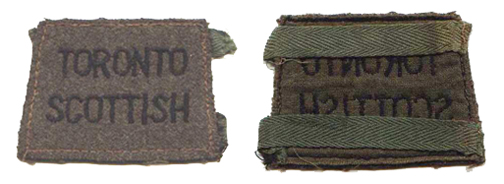
Khaki drill slip-on. North Nova Scotia Highlanders. Bill Alexander
Previously attributed to British manufacture, this pattern of slip-on has now been identified as a non-authorized pattern made in Canada. Note the method of construction. The backing was a piece of cotton matching the trapezoid of the facing, but only stitched on the two sides. This made the pocket for the slip-on. Bill Alexander

Various patterns of slip-ons. From top left, authorized issue worsted slip-on. Top right, khaki drill authorized issue. Bottom left, British manufacture worsted slip-on. Note the construction details. Bottom right, non-authorized Canadian made worsted slip-on. Bill Alexander
Felt:
Felt is made of compressed fabric particles, rather than the woven threads of wool. When examined under magnification, there is no weave pattern but rather a jumble of threads. Manufacturing companies produced most felt insignia without backing. Some felt titles/patches were acquired early in the war, some Canadian made, and some British manufacture. Canadian felt titles were usually produced by spraying or painting the designation on the title. This process is sometimes referred to as “flocking” or “painted”. Felt was less durable in wear. These titles quickly faded and fell apart in use.
Late in the war a British made issue of felt titles for Canadian units appeared overseas. These were embroidered on felt and coated on the reverse with a sizing or glue compound, thus the name ‘starch-backs’ or ‘glue-backs. No documentation has been found authorizing the official acquisition of this pattern of title.
Canadian flocked felt title. Note mis-spelling. Bill Alexander
British made embroidered melton, starch back title, showing the characteristic stitching and glue or sized backing. Raymond Gilbert
Embroidered Melton:
Melton is a tightly woven wool fabric with heavily brushed nap giving the fabric a smooth finish. This fabric had letters, numbers or designs embroidered in silk thread on the body of the title. One method of distinguishing a melton patch from a felt one is by examining the edges of the cloth with a magnifying glass. With melton, one will see threads of wool along the edge. In contrast, the felt edge is smooth and devoid of rows of threads. Wool was a controlled material during the war, which meant that the fabric for making shoulder titles and formation patches was restricted in quantity and difficult to obtain. Embroidery was to be done in silk thread, but some substitution with cotton thread appears to have been made.
Coloured embroidered insignia were initially authorized for wear by overseas units only, but in 1942, authorization to wear coloured embroidered titles was extended to active service units in Canada. By the end of the war, all active force units in Canada were wearing coloured embroidered melton titles. Some reserve units acquired and wore unauthorized coloured embroidered titles.
When the army switched to printed titles overseas, existing inventories of embroidered insignia were to be used up before printed were issued. Embroidered insignia was also allowed if the delivery of printed titles was delayed. Many units had both issues in use at the same time. Embroidered titles were authorized and some titles were acquired for units of the CAOF (Canadian Army Occupation Force) over the summer and fall of 1945.
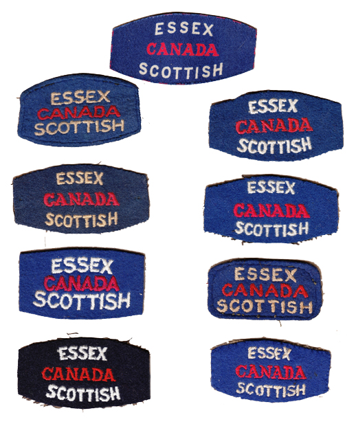
A variety of embroidered and one printed title for the Essex Scottish. Printed title, top, starch back pattern top left column, and various other issues. The patterns at top right column and second right column are post war. The pattern on the black or dark blue backing has not been documented. Bill Alexander
A variety of embroidered and one printed title for the Essex Scottish. Printed title, top, starch back pattern top left column, and various other issues. The patterns at top right column and second right column are post war. The pattern on the black or dark blue backing has not been documented. Bill Alexander
Canvas or Printed Insignia:
Canvas titles were the product of a fabric screen printing technology. The design was made using a series of meshes through which pigments were forced to produce a finely detailed printed fabric. Printed on a cotton twill material or cotton satin material these patches were of a two piece construction. The printed obverse fabric was bonded to a cotton backing. The edges were sealed to minimise fraying. Many printed designs were direct copies from melton patterns submitted by regiments and corps. Others were new designs. Only one maker, Calico Printers Association, produced the printed titles and patches in the United Kingdom. Printed titles only exist for units on the order of battle for the overseas army. The Canadian Forestry Corps overseas insignia was a triangular patch. The Canadian Women’s Army Corps (CWAC), and the Canadian Intelligence Corps did not have printed titles. 1 Canadian Armoured Carrier Regiment (1 CACR) was not authorized regimental titles through the Royal Canadian Ordnance Corps (RCOC) system.
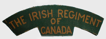
Printed shoulder title for the Irish Regiment of Canada. Cut guide lines are clearly visible around the edge. Bill Alexander
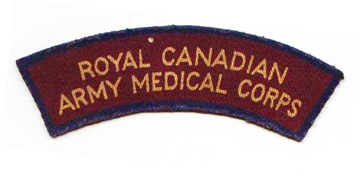
Royal Canadian Army Medical Corps printed shoulder title. Raymond Gilbert
Shows the approximate time during the Second World War when each type of shoulder title was introduced and used.
 In late 1942, the Canadian Army (Overseas) authorized the switch from embroidered patches to printed cotton. From that date, the only officially authorized Canadian army overseas insignia was printed insignia. This policy remained in force until the end of the SWW. Units were required to use up their holdings of melton titles and patches before issuing printed insignia. After investigation, it was found that printed titles could not be produced in Canada. The only feasible method of production available was embroidered melton titles. Embroidered wool titles would be the only official issue to the army in Canada for the duration of the war.
Overview of the production of shoulder insignia
Cloth titles, because of the harsh wear and suboptimal washings, were required to have the following characteristics: durability, low production costs, resistance to colour fading and loss of shape. Excessive fraying of the edges was not acceptable. Meeting all the criteria with only one of any of the above materials was an unattainable goal.
Approval to wear worsted slip-on titles was granted in late 1939, but no officially authorized slip-ons were procured until 1940. Immediately, it became apparent they would be obstructed by equipment and damaged by the rifle and field use. Identification of the unit was difficult. Alternatives were quickly sought. They were allocated to use by the reserve army in 1942.
Coloured embroidered titles were authorized for overseas use in late 1940, and authorized for active service units in Canada in early 1942. The first issues of coloured titles were embroidered on melton wool, but the price per item was very high and supply sporadic. A few titles and patches were acquired in felt, but they proved fragile in use. (Note: The P.P.C.L.I. had been granted the dress distinction of wearing embroidered shoulder titles at the end of the First World War. They continued to wear them at the outbreak of the SWW. At least two other units had cloth titles before the SWW, the Canadian Grenadier Guards and the Governor General’s Foot Guards. And, the Canadian Provost Corps were authorized coloured embroidered titles in 1940, well before the general authorization.)
To adopt coloured shoulder titles, each regiment or corps submitted a proposed design, which embodied or symbolized the name and history of the unit, to National Defence Headquarters (NDHQ) for approval. If overseas, designs were submitted to the Senior Officer Commanding Combatant Forces for approval. Once approved, contracts were tendered, sample titles submitted, patterns sealed, titles manufactured, and then sent to ordnance depots for distribution to units, where they were issued. The scale of issue for each soldier was 6 shoulder insignia, 4 for battledress use and 2 for the greatcoat. In the case of corps shoulder title insignia, (as in the Royal Canadian Army Medical Corps, Royal Canadian Army Pay Corps, Royal Canadian Engineers, etc.), the same procedure was followed.
Many companies in both Canada and Britain produced embroidered wool insignia for the Canadian Army. Some of these companies had army contracts; others were a private purchase by a military unit, or by individual soldiers. As wool was a controlled war material, and embroidery was a time consuming production method, the army looked for a more economic way to acquire the vast quantities of insignia that were needed. Alternatives were sought, and the product produced by Calico Printers was examined. Canadian Military Headquarters was satisfied that their printed canvas badges met the criteria for useful insignia.
In early 1944, the Canadian Army (Overseas) decided to simplify the system of formation insignia. All imposed formation patches would be switched to plain patches, eliminating the patches that had regimental or corps abbreviations on them. All units were required to adopt the printed shoulder title and plain formation patch. (The Royal Canadian Corps of Signals did not adopt this change and at the end of the war they were still using imposed formation patches. Some Royal Canadian Artillery imposed formation patches also remained in use until the end of the war.)
Canadian made “imposed” formation patch for 3 Canadian Infantry Division, Canadian Dental Corps. Raymond Gilbert.
Printed titles were not popular. Some service personnel felt that they didn’t stand up well to washings and faded in sunlight. Some Canadian soldiers trimmed the new canvas patches for their uniform. This removed the factory bonded edges, resulting in fraying. Whatever the issues, printed titles were much cheaper and quicker to make than the embroidered ones, even if they had to be replaced more frequently. They remained the official overseas insignia until the army left the United Kingdom.
In mid 1945, British made starch-backs felt titles for Canadian units appeared. The provenance of this pattern has not been conclusively established, but evidence indicates that the felt titles may exist for every unit on the RCOC overseas inventory. No official authorization has been found for this pattern. (Note: The Canadian Forestry Corps, CWAC, and Canadian Intelligence Corps were not on the RCOC inventories of titles for overseas. 1 CACR did not have officially authorized insignia, and had acquired shoulder and cap badges through private purchase. Starch back patterns have not been found for any of these units.)
Two other factors impacted the issue of shoulder titles. Many units had their designations changed over the course of the war. The Cameron Highlanders of Ottawa started the war with the designation M.G. (Machine Gun), lost the designation mid-war and then regained the same designation later in the war. Appropriate titles were authorized and made to reflect these designation changes. Other units that experienced designation changes during the war also obtained new issues of titles.
When shortages made official issues impossible, or when personnel wanted to “dandy” up their battledress, soldiers being soldiers, they obtained tailor made or private purchase insignia. These patterns are difficult to document, and the provenance must be established on a case by case basis.
Characteristics of British and Canadian Titles
The following is a list of some of the major characteristics of shoulder titles. The list is by no means exhaustive nor exclusive.
- Most British made cloth insignia have the silk stitching on an oblique angle
- Canadian embroidery machines made a horizontal stitch.
- All canvas patches and titles are UK made and were made under the authority of the Canadian Military Headquarters in the UK. There are two exceptions to this rule. The printed Kiska patch was made in North America. It is completely different from overseas printed insignia. The provenance of the Canadian Army Trades School printed patch has not been documented.
- Most starch-back patches with oblique embroidery are European issue. (There are various explanations for the makers of this insignia, but to date there is no substantiated conclusion.)
- Thick letters on the insignia suggest SWW vintage.
- Serif lettering is an indication of SWW vintage
British made embroidered title. Note oblique pattern to the stitching and back showing the embroidery pattern and the heavy cotton backing material. Collectors will find a wide variety of backings and embroidery patterns. Familiarizing oneself with the types of backings and embroidery is a useful method of establishing authenticity of titles. Raymond Gilbert
Backing of a Canadian made title. Note embroidery pattern and backing material. Raymond Gilbert
Backing material
- Most embroidered shoulder titles have some sort of backing material. Black or tan/ khaki cotton backing material is the most common. Some have a paper, or padded backing. On occasions the soldier modified the backing.
- Starch back titles have a layer or glue or sizing leaving an opaque white film on the back
Back of a British made title, showing the embroidery pattern and the heavy cotton backing material. Collectors will find a wide variety of backings and embroidery patterns. Familiarizing oneself with the types of backings and embroidery is a useful method of establishing authenticity of titles. Raymond Gilbert
Backing of a Canadian made title. Note embroidery pattern and backing material. Raymond Gilbert
Detecting Fakes
Unfortunately, Canadian cloth shoulder titles have been subject to extensive reproduction, and questionable titles are entering the market on a regular basis. With the increasing value of shoulder titles, a collector needs to be wary when acquiring titles.
- A thread from the patch will burn with ash if it is a natural fibre. If the fibre melts it is synthetic and so the insignia was made with post-war synthetic materials.
- The thread glows under ultraviolet light (‘black light”), which means that the thread is synthetic and post war. Caution should be used with this technique. Modern cleaning may have left traces that glow.
- The title is made in a method not approved for the time period or for that unit
(Examples of the Film and Photo Unit are found in a fully embroidered pattern, which was not used for Canadian titles at the time the unit existed.)
- The colour of the patch is not an accurate match to the colour of original insignia
- The designation on the title is not appropriate to the time period.
- The embroidery doesn’t go through to the backing material. There are notable exceptions to this guideline; for example, some Régiment de la Chaudière and Highland Light Infantry SWW titles do not have the embroidery thread through the backing.
Caring and storage of cloth insignia:
- Sunlight/light, moisture and heat are the enemies of cloth. Cloths should be stored in cool, low humidity areas out of bright light. Avoid exposing cloth to direct light for long periods of time.
- Extreme caution should be used when working with or handling cloth.
- Dirt is an enemy of fabric. A gentle cold water rinse to remove soil may be necessary, with air drying.
- Mounting: In the past many people have used various glues to paste the insignia into books or photo albums. Today most collectors leave the patch free or use masking tape or double-sided tape for mounting. Acid-free photograph hinges are an alternative. Plastic, if used to cover the cloth, should also be acid-free.
- Mounting surfaces or card stock, if used for mounting, should be acid free materials.
- Old glue: If desired this can be carefully broken off by gentle folding or rolling the cloth and the glue will crack into smaller pieces which can be picked off. This method will not likely remove all the glue. Certain types of glue may be removed using Zero and cold water.
- Rubbing alcohol or chemicals can also remove glue. The cloth should be tested first in a small area before applying these more aggressive agents.
- If the item in question is rare, it may be wise to approach a professional conservationist for preservation advice.
Summary:
Canadian Second World War insignia is a fascinating area of militaria collecting. Establishing the proper issue of insignia for the time period is a challenging and confusing exercise. The information provided in this overview is intended as an introductory guide to the cloth shoulder titles issued in the Canadian army. Research into the history and deployment of units can assist in documenting the evolution of the insignia for particular regiments and corps.
References:
The information in this article is derived from the documentation held in Library and Archives Canada, Record Group 24, Various Volumes and Files.
by Clive M. Law
With the 1903 introduction of the ‘Naval’ or ‘staff’ pattern forage cap throughout the Canadian Militia many individual Militia regiments found themselves in need of an appropriate badge to decorate this new style of cap. Some regiments had previously worn a badge on the Glengarry and simply adopted these as an interim measure. Other regiments, however, had either worn numerals or nothing on their Glengarries. Shortly after the February 1904, General Order (GO 18) approved the ‘Naval’ pattern forage cap for the use the 67th “Carleton Light Infantry”, their Commanding Officer felt that the new forage cap was an opportunity to acquire a new, distinctive, badge.
In early May 1904, Lieutenant-Colonel J. Baker, the Commanding Officer, submitted a design to the District Officer Commanding, Militia District 8. The submission was forwarded to Ottawa and, ultimately, General Order 77 was published in June 1904. This GO described the badge as ‘On a bronze maple leaf, a silver ring, inscribed “67th Regiment Carleton Light Infantry”, surmounted by a beaver, and in gilt, within the ring, a deer in the open with hills in the background. Underneath, on a scroll, the motto “FIDELIS PATRIAE.” The badge is described again in the 1907 Dress Regulations.
The incredibly quick approval, from submission in May to approval in June, would not re-occur.
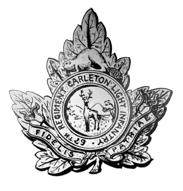
Fig 1 – Original drawing submitted to headquarters
for approval in May 1904.
No change was made to the badge until the re-organization of the Militia in 1920. The sweeping changes saw a number of amalgamations as well as changes in designations to old units. In the case of the 67th ‘Carleton Light Infantry’ they, along with all of the other numbered Infantry regiments, lost their number and were now to be known as the ‘Carleton Light Infantry’. In April 1921, the Commanding Officer submitted a new design which incorporated “1st Battalion” (although, a two battalion Regiment, the Commanding Officer never once made any reference to this second battalion). The use of the battalion number on the cap badge was objected to by District Headquarters as an unnecessary expense. HQ stated that the battalion number should not be incorporated into the cap badge but could be shown on the shoulder titles, once these were approved. In June 1921, the CO was requested to ‘correct’ the design and to re-submit. Several months passed before HQ prodded the CO for an answer and, finally, in October received a new badge description. With this in hand the approval process was put into motion and the Deputy Minister of Militia approved the new badges at a meeting of the Militia Council, on 3 March 1922. The approval document read as:
The Quartermaster-General submits for the consideration of the Honourable, the Minister in Militia Council, the question of the provision of badges for the Carleton Light Infantry, being necessary in consequence of the re-organization of the unit.
In 1925 it was discovered that the CLI badges had been manufactured and supplied to the regiment yet no approval for these had ever been published in General Orders. This oversight was remedied with an amendment to the 1907 Dress Regulations (GO 2, 1926) deleting the old badge description and replacing it with that of the ‘new’ badge.

Fig 2 – (left to right)
Original 1920 design showing the battalion number crossed out.
Final artwok for the 1920 design.
Production badge (courtesy BritishBadge Forum)
The CLI made a good reputation amongst Militia regiments in the Maritimes and, in 1930, came second in the Canadian Infantry competition of Militia regiments. That same year the CO proposed a change to the badge in order to incorporate the “Kentish horse” and a change of the motto to “INVICTA”. These elements were taken from the CLI’s allied British regiment, the Queen’s Own Royal West Kent Regiment. In order to proceed with the change the CO had to agree that public funds could not be used and any costs associated to the replacement badge would be borne by the regiment. The Regiment also proposed collar badges with the Kent horse rearing on a scroll marked “INVICTA”.
HQ turned to Colonel Fortescu Duguid, Director of Historical Section (DHS) for his comments on the proposed badges. Fortescu was an avid heraldist and historian and was deeply involved in early designs for a proposed Canadian flag in the 1930s.
Duguid recommended that the cap badge be amended so that the maple leaves used in the wreath were of the same pattern as those approved for Regimental Colours. He also suggested that, while the white horse of Kent was a ‘traditional’ symbol and not an ‘honour’ bestowed on the West Kent Regiment, the use of “INVICTA” would require Royal assent before the Carleton Light Infantry could adopt it in lieu of their approved motto “FIDELIS PATRIAE”.
Col Duguid also pointed out that the numerals (note 1) should not appear on the badge and that “The name of the unit should read continuously on the scroll, although it is to be noted that the scroll on the badge of the allied unit reads “ROYAL KENT WEST”. In this case the word “CARLETON’ would be better in centre section of scroll; then LIGHT INF. might be further contracted to LI and placed in terminal section.”

Fig 3 – Original drawing submitted by the CLI, note the gaps between the maple leaves and
the horse.
Design modified by HQ. The numerals, and title have been changed.
An officer’s badge in gilt and silver (courtesy Chris Brooker)
Taking Duguid’s comments into consideration HQ arranged for official drawings to be prepared by the Geographical Section of the General Staff (GSGS). The accompanying notes supported Duguid’s comments and went a bit further by stating that the maple leaves should touch the feet and tail of the rearing horse to “strengthen” the badge. HQ was also concerned with the proposed collar badge believing that it would be too flimsy. They proposed, instead, that the CLI use a reduced version of the cap badge or add a spray of maple leaves to provide better support. To support their argument, HQ contacted William Scully Ltd., of Montreal, who replied: “While it is not desirable to make up badges with weakened points such as are manifest in the sample submitted, the heavier gauge of metal now specified by the Department for use in such badges greatly overcomes the difficulty met with many years ago. We consider the sample badge sufficiently strong from a structural point of view, and feel that there would be no great difficulty in making the necessary die and tools.”
Accordingly, in January 1931, GSGS prepared drawings for CLI approval but the Regiment insisted on the original design. With the design now finalized, HQ sought formal approval from the War office – for the use of the Royal West Kent badge as adapted to the CLI, from the King – for the use of the White Horse of Kent and, finally, from the Minister of Militia – for final Canadian approval prior to publication in General Orders.
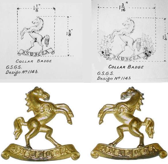
Fig 4 – Original collar badge design.
Proposed designs with the addition of maple leaves.
Production badge (courtesy British Badge Forum).
By 20 May 1931, all approvals had been filed and the new badge was described in GO 74. In keeping with the original request, the Regiment was now responsible for the production of the badges, including the manufacture of dies and tools. Once the badges were made and distributed the dies, and sample badges, were to be sent to HQ. At this point the tale should end, however, by September 1931, HQ asked the CLI why they had not yet changed over to the new, “approved” badge?
The Regiment took their time in replying and, in December, informed HQ that “the C.O., Carleton Light Infantry advises that owing to the expense involved in connection with the obtaining of dies and new badges, it will be a considerable time before a finality can be reached in regard to this question.”
HQ agreed to a six-month delay in obtaining badges but took advantage of the opportunity to remind the CLI that Royal assent was obtained and that the CLI were currently wearing unauthorized badges, a situation they described as ‘irregular’. Nonetheless, by February 1934, the dies had still not been made and the CLI, under its new Commanding Officer, Lt-Col W.B. Manzer, asked HQ to consider the use of public funds, arguing that “It was found that the situation, as regards the possibility of funds being available for the purchase, had considerably changed, and that due to the present financial conditions by which everyone is seriously handicapped, there was little likelihood of funds being available for the purchase of these dies and tools, etc. and provision of Badges.” HQ declined to pay for these as it would set an unacceptable precedent.
Finally, on 24 November 1934, over three years after the publication of the General Order, the CLI wrote HQ: “The Unit is still unable to find sufficient funds to cover the cost of purchasing the necessary Dies and Tools together with a first issue of 500 sets of Badges. The cost of the foregoing is estimated to be as follows: Dies and Tools $292.00, 500 sets Badges $125.00.
The total amount available at the present time and at the disposal of the Commanding Officer for this purpose is only $240.00. The Commanding Officer states that in view of the present restricted training establishment, a first issue of only 200 sets of Badges should be quite sufficient for immediate requirements.” The CLI indicated that they were prepared to raise the necessary funds if permission to limit the initial quantity to 200 sets was approved.
The approval for the reduced quantity was communicated to the CLI and Scully provided lead impressions of the badges in February 1935. In May 1935, the badges were finally distributed to the CLI, with a sample set deposited at HQ. However, the badges had a short life as, on 15 December 1936, it was amalgamated with The York Regiment and renamed The Carleton and York Regiment.
On 31 October 1954, The Carleton and York Regiment was amalgamated with The New Brunswick Scottish and redesignated the 1st Battalion, The New Brunswick Regiment (Carleton and York). On 18 May 1956, the regiment was redesignated as The Royal New Brunswick Regiment.
1. The proposed design included the numbers 44 (representing the 44th Battalion, CEF which was perpetuated by the 1st Bn, CLI), 67 (representing the CLI’s former regimental number), and 104 (representing the 104th Battalion, CEF which was perpetuated by the 2st Bn, CLI)
by Clive M. Law
Following a suggestion made by the Adjutant-General of the Canadian Army, the Army Council, on 22 June 1944, agreed that ‘a distinctive badge or flash’ should be authorized for the Canadian Infantry Corps.
What is surprising is not the decision to approve such a distinction but, rather, that it took so long before the suggestion was even made. An approved shoulder title for the Canadian Armoured Corps, officially formed in August, 1940, had already been in wear as the de facto insignia for instructors posted to the Canadian Armoured Corps Reinforcement Unit, all unattached armoured troops as well as for most units in the 5th Canadian Armoured Division. Other Corps, including the Royal Canadian Engineers, Royal Canadian Army Service Corps, Royal Canadian Corps of Signals and many others, had had corps-specific shoulder titles on issue for almost two years.
The delay in authorizing a flash for the Infantry can be explained by the system of training that existed at the beginning of the war which saw recruits enrolled directly into regiments and trained by a regimental cadre. As the war progressed this was found to be inefficient and Basic Training Centres (BTC) were established to take on this responsibility. The instructors were originally seconded from infantry regiments and wore the unit title of their parent unit – if one existed. Over time, an increasing number of the instructor cadre either had no regimental affiliation or were transferred to the BTC establishment and had no regimental title to wear. Further, while trainees in other Corps were authorized to wear the Corps title immediately upon issue of their uniform, Infantry trainees, who were not yet affiliated with a regiment, had no insignia to wear. These two scenarios led to a lack of identity and to morale issues. Recognizing this, the Army proposed a distinctive title for the Canadian Infantry Corps.
Although the Army Council agreed to the concept of distinctive insignia they were not in agreement over two points and they requested that the Adjutant-General consider if the insignia should deviate from the standard ‘regimental flash’ pattern, and, if wear of the insignia should be extended to NRMA personnel serving in the Canadian Infantry Corps
The National Resources Mobilization Act (NRMA) had originally been passed in 1940 and gave the Canadian government the authority to conscript men into the Canadian Army. At the time these draftees were limited to home defence and were not liable for overseas service. By 1942, however, military forecasts of personnel shortages forced a referendum on the question of overseas service. In spite of major divisions across the country, including in Quebec where the Canadian Army was seen as an Anglophile bastion, the NRMA was amended and the government was given the power to draft Canadian men for General Service, i.e., sent overseas to serve in a combat role.
At the time of the Army Council approval for the badge, in June 1944, the NRMA debate was still raging and the amendment was scheduled to be enacted in December of that year. It was in this environment that the question was raised about the eligibility of NRMA personnel to wear the new insignia.
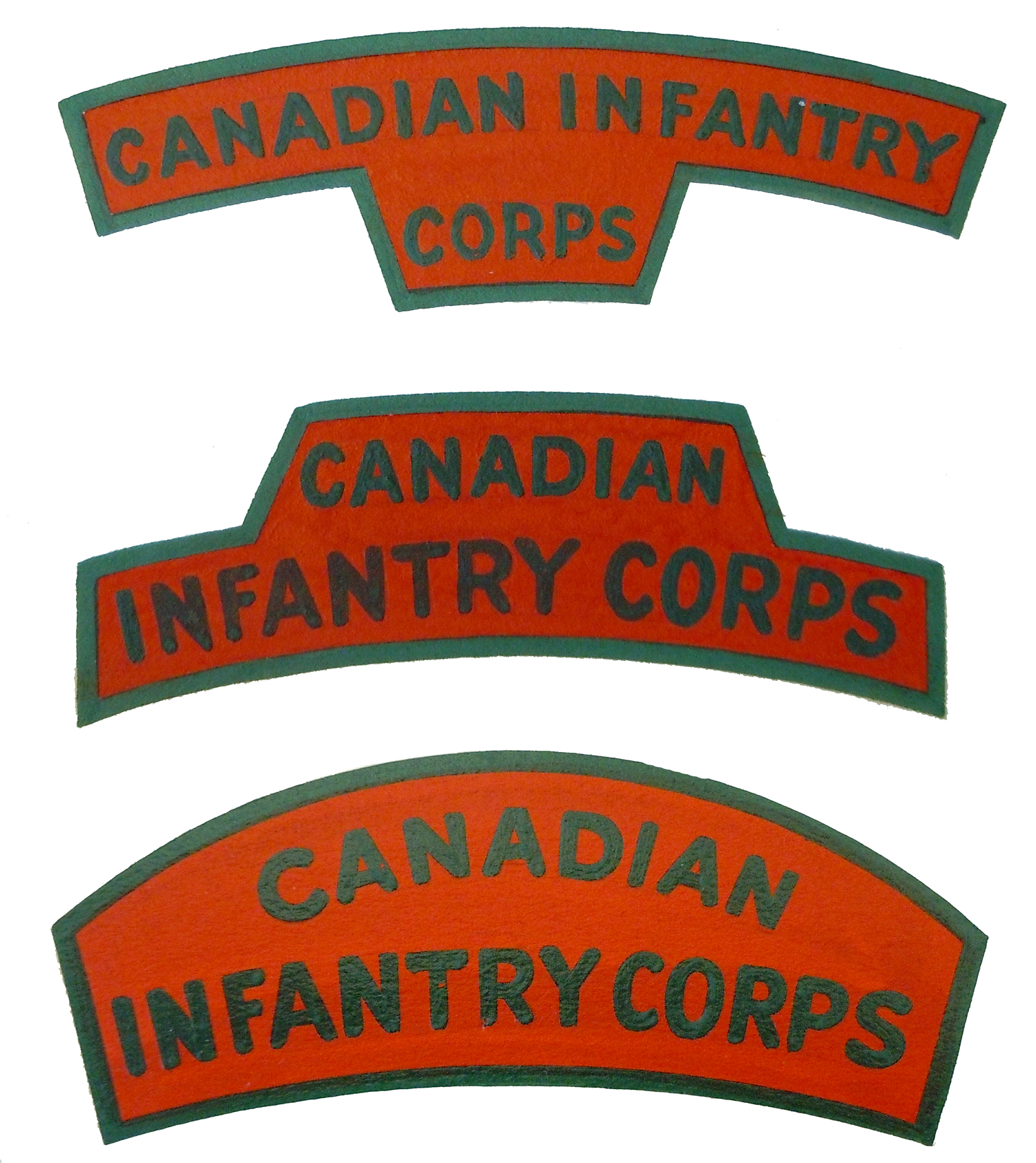
Fig 1 – The three original designs closely followed the standard shape for Corps titles. The red and green colours represented both Line and Rifle Regiments.
By the end of July 1944, three possible designs were submitted for selection. These patches had two elements in common; both emulated the shapes in use for unit titles (shoulder flashes) and both used Scarlet, representing Infantry of the Line, and Green, in recognition of Rifle tradition.

Fig 2 – A selection of titles proposed during the second round of design. These titles used the elements found on the Canadian Infantry Corps cap badge.
None of the three designs was found to be suitable – due solely to their similarity to regimental shoulder flashes. This is unusual as all other Corps used cloth insignia identical in shape to regimental titles. One of the suggestions was even in the exact same shape as that previously approved for the Canadian Armoured Corps. The Master-General of the Ordnance suggested that new designs be developed and that the existing Canadian Infantry Corps cap badge could provide a theme. This led to a flurry of new designs, most of which now incorporated crossed rifles and a sprig of maple leaves. The red and green colour motif was retained although some suggestions included white.
At this point the venerable Director of the Army Historical Section, Colonel A. Fortescu Duguid, waded into the debate. Duguid was an avid heraldry enthusiast and had been actively involved in the pre-war flag debate (this debate was even more vociferous than the one in the mid-1960s which resulted in today’s Maple Leaf flag.)
Duguid called upon approved heraldic elements and suggested that the Canadian Infantry Corps patch be limited to red and white – by Royal proclamation the official colours of Canada since November 1922. This same proclamation stated that the “main device… to represent Canada” was to be three leaves sprouting from a single twig. And that the badge for Canada was a red maple leaf. Duguid also suggested that, as the maple leaves were readily identifiable as representing Canada there was no need to use the word ‘Canada’ or ‘Canadian’ as this would be unnecessary repetition. Taking these elements into consideration Duguid proposed a design which was quickly accepted.
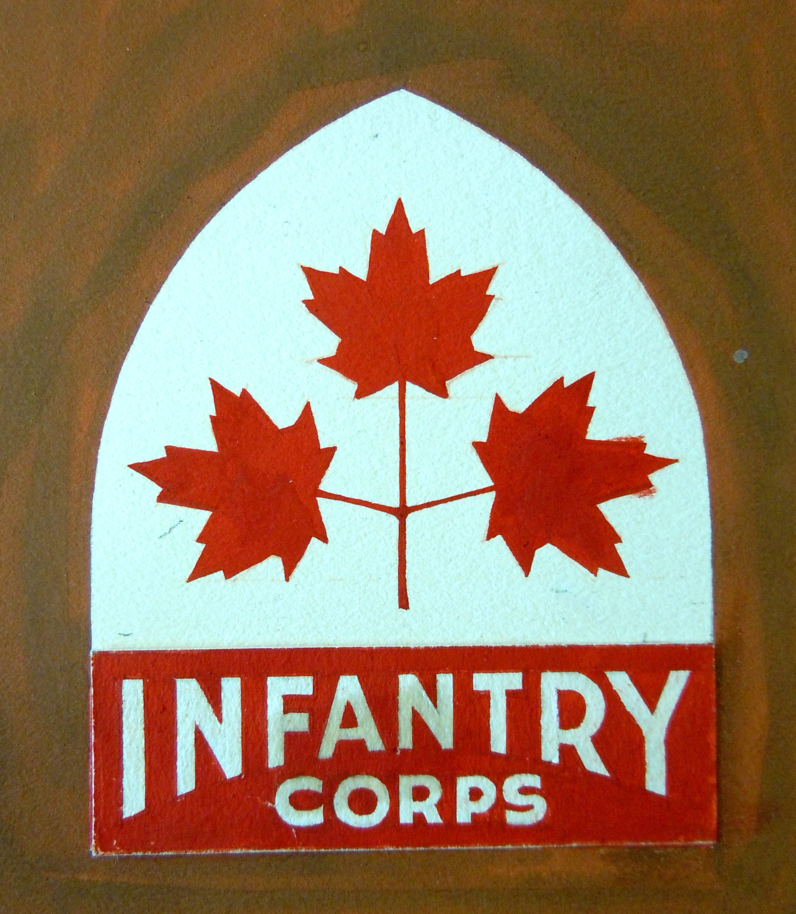
Fig 3 – The original artwork for Colonel Duguid’s approved design.
Duguid also wanted to incorporate the Infantry motto “Acer”, meaning swift – keen – eager – penetrating. He had hoped that it would become as well known as “Ubique” had become for the Artillery and the Engineers.
Following design approval it remained to have samples of the badge manufactured for examination. The Inspection Board of the United Kingdom and Canada (IB) arranged for three examples to be made up. Two of these samples were made with embroidery on two pieces of Melton wool while the third sample was embroidered on one piece of white Melton. The two-piece samples were selected and, after confirming with the Department of Munitions and Supply that a sufficient quantity of red and white Melton wool was available, a contract (Contract Demand Clothing D-46) was let with the Brocklehurst Swiss Embroidery Company of Toronto, for 50,000 pairs. These were to be delivered in lots of 10,000 pairs per week.
With production well underway National Defence Headquarters addressed the issue of who would be allowed to wear the insignia. A draft Routine Order was circulated for comment which stated that the badge would be worn by “unposted reinforcements of the Canadian Infantry Corps until such time as the reinforcement is allocated to a specific regiment or unit.” It went on to explain that the initial issue of insignia would be made to new recruits simultaneously with the issue of the uniform immediately following attestation into the Canadian Army (Active). Surprisingly, the next paragraph clearly stated that the insignia would “not be worn by NRMA personnel of the Canadian Infantry Corps.”
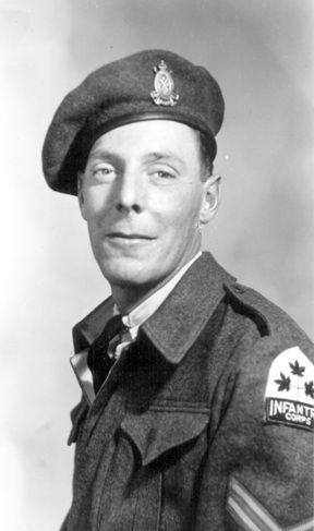
FIG 4 – 4 – The Melton title worn here by a Corporal in the Canadian Infantry Corps with no regimental affiliation. He is most likely on the cadre of a Basic Training Centre.
This draft was circulated in October 1944, mere weeks before enactment of the new NRMA and the prohibition may have reflected the almost institutional dislike of NRMA soldiers, derisively termed ‘zombies’, by the vast majority of Active Service volunteers. To ensure that the Routine Order would survive a judicial review the Judge Advocate General’s office was asked to provide legal comment. They stated that there was no legal objection to excluding the NRMA. Nonetheless, the Director Administration for the Canadian Army pointed out that no other Corps title had ever been limited to General Service soldiers in any of the other Corps of the Canadian Army. This was supported by the Director of Ordnance Services who pointed out that NRMA soldiers of other Corps wear the shoulder badge of their respective Corps and that it would be inconsistent with present policy to refuse NRMA soldiers to wear the badge. In response the Chief of the General Staff wrote that his “reaction is that NRMA should not wear it (the patch)”. Amidst the conflict the question was sent back to the Army Council, which, on 26 October 1944, concurred with the draft RO – that the badge should not be worn by NRMA soldiers. Accordingly, Canadian Army Routine Order (CARO) 5053 was promulgated on 4 November 1944.
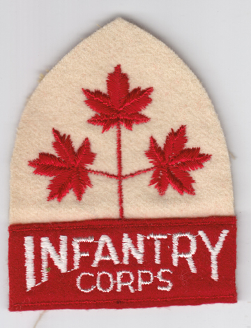
FIG 5 – The full title, as approved by National Defence Headquarters.
By all normal accounts this would close the book on the design and use of this patch. However, the insignia’s unusual design, its size and the use of bold, contrasting colours, invited at least one formal contradictory comment. The District Officer Commanding MD4 addressed a number of concerns with the badge, not least of which was its size; 3¼ inches high compared to the average shoulder title of 1¼ inches high. The DOC also took exception to the white colour which he claimed would lose its “pure white colour after a few days of wear and especially after a day’s training in the field by men doing fieldcraft, field works, crawling, etc…”
The DOC also made clear his dislike of the maple leaves claiming that other Corps used only letters or names. He also felt that the badge should be inverted in order that it be worn with the point facing downwards. Finally, he raised the question of the prohibition against NRMA men wearing the patch, pointing out that NRMA men of other Corps were entitled to wear their corps patch. In spite of his letter, NDHQ did not budge on any point claiming, in a draft letter, that CARO 5053 would not be revisited.
While the issue of the title moved forward in Canada, reinforcements, upon arrival in the United Kingdom, were wearing a title that looked like a formation patch. Canadian Military Headquarters (CMHQ), in communications with Ottawa, stated that the patch was inappropriate and confusing. Additionally, there was no infantry corps title in use overseas, and no ability to provide Melton titles such as those being worn by personnel from Canada. With the re-organization of the reinforcement and training battalions in the UK there now existed a large demand for CIC titles. To meet this need, and to address the issues of Melton cloth, size and design of the Canadian title, CMHQ designed and approved a two-line title, printed dark green on scarlet (these are also found in coloured embroidered material.) Ironically, the CMHQ design was almost identical to an early submission which emulated the shape of the Canadian Armoured Corps title.

FIG 6 – Printed and embroidered titles, manufactured in the UK, to CMHQ’s design and worn overseas.
In Canada, within a year of the first issue, the Canadian Infantry Corps patch was modified by unstitching the red Melton portion from the shield portion and wearing it by itself, resulting in a simple “Infantry Corps” shoulder title. These Infantry Corps titles were eventually manufactured by themselves, without the leaf portion. This appears to have been in response to the argument that the title was confused with formation patches, and that it soiled easily.
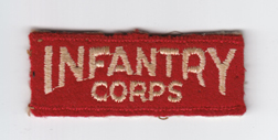
FIG 7 – 7 – Following dissatisfaction with the original patch due to its size and that it soiled quickly, the lower ‘tab’ of the patch was removed fro the ‘shield’ and worn on its own.
The author wishes to thank Bill Alexander for his invaluable assistance and editorial review.
